How to Stop Playing It Safe with Color and Start Making Crochet That Turns Heads
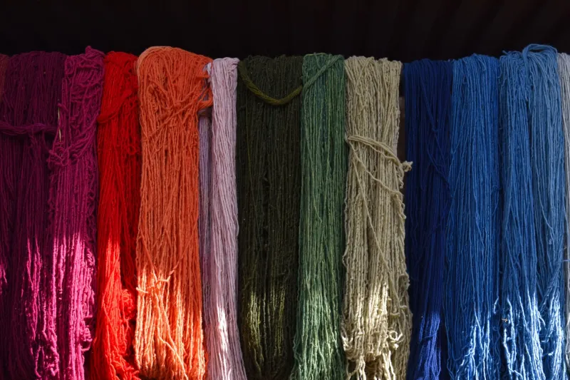
Be honest. How many of your finished projects are in cream, gray, or that one safe dusty sage you keep going back to? There's nothing wrong with neutrals — they're classics for a reason — but if your yarn stash is starting to look like a foggy morning in Seattle, it might be time to talk about color.
Not the intimidating art-school version of color theory with color wheels and Pantone swatches. The real, practical, you're-standing-in-the-yarn-aisle-at-Joann-and-need-to-make-a-decision kind of color knowledge that actually helps.
Let's get into it.
Why Color Feels So Personal (And Why That's Actually Science)
Here's something wild: your emotional response to color isn't just a matter of taste. It's deeply psychological, and researchers have been studying it for decades. The field of color psychology explores how different hues affect mood, perception, and even behavior — and when you're making something wearable or decorative, those effects really do matter.
Warm colors — think reds, oranges, and golden yellows — tend to feel energizing and attention-grabbing. They read as bold, passionate, and a little daring. Cool colors like blues, greens, and purples have the opposite pull. They feel calm, grounded, and approachable. Neutrals sit in the middle, offering a kind of visual rest that lets other elements in an outfit or room breathe.
When you pick up a skein of terracotta yarn, there's a reason it feels earthy and comforting. When you reach for cobalt blue, there's a reason it feels crisp and confident. Leaning into that awareness — instead of just grabbing whatever's on sale — is how you start making color choices that feel intentional.
The Color Wheel Isn't Just for Art Class
Okay, we do need to talk about the color wheel for a second, but we're keeping it simple. There are three basic color relationships worth knowing:
Complementary colors sit directly across from each other on the wheel — like orange and blue, or purple and yellow. These combos have serious visual punch. They make each other look more vibrant when placed side by side, which is why a mustard yellow granny square blanket with deep violet accents feels so alive.
Analogous colors are neighbors on the wheel — like teal, blue, and blue-violet. These palettes feel harmonious and cohesive because the hues share undertones. If you want something that looks polished without a lot of effort, analogous color schemes are your best friend.
Triadic colors form an equilateral triangle on the wheel — red, yellow, and blue being the classic example. These are trickier to pull off, but when they work, they feel playful and dynamic. Think of a striped market bag that somehow manages to feel retro and fresh at the same time.
You don't need to memorize any of this. But having a loose understanding of why certain color combos feel balanced — and others feel chaotic — gives you a framework to experiment with confidence.
Value and Saturation: The Two Things Most People Ignore
Here's where a lot of makers get tripped up. Two colors can be complementary on the wheel but still clash in practice — and it usually comes down to value (how light or dark a color is) and saturation (how vivid or muted it is).
Mixing a pale, dusty pink with a bright, electric green is technically complementary — but the difference in saturation creates visual tension that feels jarring rather than exciting. Meanwhile, pairing a dusty rose with a muted sage? That's the same color relationship, just with matched saturation levels, and suddenly it feels like a Pinterest board come to life.
A quick trick: when you're building a palette, try to keep your saturation levels in the same neighborhood. All muted, all bright, or one pop of vivid against a field of softer tones. Mixing saturation levels wildly is usually what makes a color combo feel "off" — not the hues themselves.
Building a Color Signature Without Overthinking It
Some of the most recognizable makers out there have a signature palette — a set of colors that shows up across their work and makes their feed feel cohesive. You don't need a brand strategy to develop one. You just need to pay attention to what you're already drawn to.
Pull out three or four finished projects you genuinely love. What do they have in common? Are they all warm-toned? Do they all have at least one pop of something unexpected? Are the backgrounds consistently light or dark? You're already making color decisions — you're just not making them consciously yet.
Once you notice your instincts, you can start building on them. Maybe you love warm neutrals but always feel like something's missing — try adding a single accent color in a rich, saturated jewel tone. Maybe you love bold colors but your finished pieces feel busy — try anchoring them with a larger proportion of one dominant hue.
Color and Wearability: What Actually Flatters
If you're making wearables — sweaters, shawls, hats, bags — there's another layer to consider: how the color reads against your skin and in the context of the rest of your wardrobe.
Colors have undertones (warm, cool, or neutral), and so does your skin. When those undertones align, the whole look feels effortless. When they clash, even the most beautiful yarn can make a finished garment feel somehow "not quite right" once you put it on.
A quick way to test this before you commit to a whole sweater's worth of yarn: hold the skein up near your face in natural light. Does your skin look brighter and more awake, or a little dull and washed out? Your gut reaction is usually right.
Also think about your existing wardrobe. A stunning rust-orange cardigan is going to work a lot harder for you if you already wear a lot of warm-toned neutrals than if your closet is full of cool grays and navies. Handmade pieces are investments of time and love — they deserve to actually get worn.
One Simple Exercise to Level Up Your Color Game
Before your next project, try this: pick your main color first, then choose a secondary color using the complementary or analogous relationship. Finally, add one neutral that matches the saturation level of your two main colors.
That's it. Three colors, a loose framework, and a willingness to try something outside your comfort zone. You might end up with a palette that surprises you — and that's exactly the point.
Color is a skill, and like every other skill in crochet, it gets easier the more you practice it. You don't have to get it perfect on the first try. You just have to start making more intentional choices, one skein at a time.
And honestly? That's when crochet really starts to feel like art.